Previously I've mentioned about small little bits of feedback and other note worthy moments where my work has changed, this small piece will be about how I ended up molding my work into what it is now. After getting the base structure down I wanted to get feedback not only on this scene but my one previous. This will be feedback from people who are currently working in the industry and how different companies have different levels of requirements.
I firstly asked the two people I'm talking to who are in the industry at high tier companies Luan Vetoreti & John Barnard for feedback as it was easy to sneak into the conversations we were having. One working at Splash damage currently (John) and one working at Foundry 42 (Luan) or as most people know it CIG (Cloud Imperium Games).
Johns feedback,
'Hey dude.
Sorry it took me so long to get back to you, it's been a crazy bust time for me as usual. (Working a full time job and then coming home each night to work on my own porfolio - it's exhausting!)
Your images look really good, honestly they're a lot better than what I was producing at Uni :) Really nice work!
There are a couple of things that jumped out at me that could be improved, and I'll try and explain them below.
Scene A - The overgrown railroad scene:
So, this is a great scene. I love the foliage, and the colours are really nice and vibrant. I particularly enjoy the way the green vegetation contrasts with the blue mist, and the red light in the background is a nice touch!
The only issue I can really see is that there's something off about the shadows and rendering on the foliage. There are some really dark areas in the scene, that look to be caused by shadows not rendering correctly on the leaves of the shrubs and trees.
Some leaves look entirely black, and the ground beneath them is really dark too. This is giving the scene a bit too much contrast,
This looks like a lightmap problem, but I can't be sure. Are you using baked lighting for this scene? Make sure you don't have overlapping UVs in your lightmaps.
I *think* there's some fancy shader setup you can do to allow some light to pass through the leaves (giving nicer shadowing), but I don't personally have experience of that. Google might be able to help, I'm not sure.
Scene B - The destroyed building scene
This is a really great start, I think this will be a cool portfolio piece. As this is WIP, there's a lot more I could critique, but I imagine you're aware of most of it already.
The main thing really is that the damaged sections could be a bit more convincing. The roof that is collapsing in looks a little bit like it has melted, rather than having cracked and collapsed. You really need much harder edges here to give the illusion of destruction. I would advice to create a few seperate "chunks" of damaged concrete, and arrange them around the opening. I would avoid having the damaged pieces a continuation of the main roof, because it is more difficult to create the effect you're looking for.
You could cut a simple hole in the roof mesh, then dress around it with some nice sculpted assets. These are a bit extreme, but are nice examples:
https://cdnb.artstation.com/p/assets/images/images/001/236/203/large/ben-wilson-asset-renders-b.jpg?1442757559
https://cdna.artstation.com/p/assets/images/images/001/236/202/large/ben-wilson-asset-renders-a.jpg?1442757556
The same could be done for the floor section. What you've got there is cool, but you'll want to dress around that hole with lots of separate broken ceramic tile meshes, lumps of rubble and debris. Don't let people see that tiled floor material blending into the soft edges near the hole.
I think those two things will help sell the "bombed" feeling dramatically. You just need to create a few nice lumps of debris and don't be shy about scattering them everywhere. This is how we do it for gears of war. It isn't an elegant process, we just go crazy with debris meshes.
Look at this guy's stuff, he's amazing at that sort of thing:
https://www.artstation.com/artwork/596qP
For example, in this shot, the hole in the road is just a single straight line cut, but the area is dressed with a lot of separate rubble meshes:
https://cdna.artstation.com/p/assets/images/images/002/933/228/large/matthew-cooke-viaducts-01.jpg?1467442180
The only other thing I could say (and this is pure opinion, so feel free to ignore), I'd be tempted to raise the roof and pull out the walls a little. Try and make the room a bit larger. It will help you to sell the scene, and give you more freedom for taking nice screenshots from different positions. If this is the home of a collector, you might want more room where he/she could have been displaying the artefacts. It's a great idea to keep portfolio pieces small (or you'll get bored before you finish them), but this looks a bit cramped for the story you're wanting to tell.
Also, the room is currently very square, you may want to consider breaking up the shapes with some more interesting meshes for the walls and ceiling.
Again, I apologise if you'd thought of all this already, it is difficult to tell with a work-in-progress scene.
What you've got so far is fab, can't wait to see the second scene finished! Hope some of this feedback has helped, if only a little bit.
Best wishes,
-John'
This was the email he sent me after I had messaged him with my portfolio and a few up to date screenshots of the older environment. The feedback given here is one of the reasons why I ended up redoing my roof and many other small assets, looking at the way debris and the way destruction falls on an area is never linear, there is always a different outcome every time. This made me realize that the roof was off, the debris needed a little work as well as maybe doing some bigger or larger assets with rebar flying out of it would enhance the overall feel of the place. This feedback has shaped the way I'll be looking at environments from now on especially seeing as he's given me some details of how the Gears of War part use their assets.
Luans feeback,
'No I remember these 🙂 Been pretty busy only now getting to look at these. Anyhoo, so, your forest scene I think is looking a bit like an old CG render, I think you could do with looking at better ways to do foliage (shader wise), using sub surface scattering, etc. Your materials do need some work, everything looks made out of clay (this applies a bit to the other scene too). It's not your textures that are the problem, well, not really anyway though they could definitely do with a facelift. But it's worth looking at some more variation in roughness and certainly can do with a higher texel ratio on a lot of your objects. Everything is looking a little low res. The mud and the train tracks look particularly low res. After that you really need to look at the lighting, You have this sunny day lighting but then the background of the scene is dark with a starry sky? It's very confusing. Consider maybe using dynamic lighting for things like that, with a nice hdri on your sky light. The trees look like they have a lot of shading errors on the leaves, I think you need to look at weighting the normals correctly on the leaves. But yeah, for that one, a lot of material work and lighting needs to be tidied up 🙂
For your second scene, again, things are looking really matte and low res, and it seems like on the floor you have these tiles that you're doing some sort of vertex blend into a dusty material? It's losing all of its normal information and just doesn't seem very integrated. Especially when you consider that the tiles wouldn't bend downwards towards the hole, and rather, be broken to hell and back if the roof caved in on them 🙂 Your debris could do with a bit more integration into the rest of the scene. perhaps a lot of smaller debris scattered around could help. The walls are very obviously repeated, and seem to be very wet for some reason? Overall the impression of the scene is quite soft, I think it'd be worth really driving the debris and destruction part and applying some of the same things I said about your forest, whereas the lighting and the materials could do with some work, and the impression I get from the scene is that everything is very clay like.'
This was a Facebook message that was sent from Luan, again this was way more interesting to read than for someone to tell me where I'm going wrong as it has pointers and directions I need to focus on rather than someone telling me something and forgetting it two seconds later due to the amount of feedback at once. I'm normally very good at remembering ideas/concepts but when it's written down it's much easier. Luan even suggested me to send him his work when we were in person so that way he can critique it properly as well as have me remember it. This is the way he prefers to work and it worked for me also. As for the feedback itself it all made sense in terms of where I need to head and what I need to do. It seems my assets are fine but my materials and lighting need work which again agreed they do, the only other asset that needs work again is the roof with minor bits of debris. This feedback as well helped me realize that I really need to work on the scene as a whole if I am to meet the requirements of the industry as well as the requirements for my University project.
My next professional feedback aside from lecturers was from a environmental artist from Darewise, Kemal Yaralioglu. This was vocal feedback but I will be asking him at a later date for feedback in writing as we've been connected on LinkdIn for a while and I've personally appreciated his work so hopefully he can give me feedback on mine if he's not to busy. As for the feedback given vocally I'll try to paraphrase most of what he said.
'The overall scene is good, the only things that can contribute more to the scene is bringing the blacks up. Personally I would try to make the scene less single sighted and bring the whole scene together using story telling. A good idea of this may be to make it night time, add some candles into the darker areas and get the scene working better from there. Other ways are to lead the eye around the scene more by either opening a door or changing the lighting to come in from a different angle. Other than this the environment as a whole is good, well put together but using just detailed lighting mode would allow you to further your environment as you wouldn't be worried about color. The sequencer is overly long and you'd lose attention too fast, I would bring it down to 30 seconds or less and just quick snaps of the scene from odd angles to avoid showcasing the whole scene whilst keeping the viewer entertained. As for the Artstation everything seems flat, to change this you would have to do a lot with lighting. Other than this the whole feel of the Artstation is nice, just improve lighting and maybe remove the wall texture as it's not the best and a lot of people have done it.'
I honestly really appreciated this feedback as before we started he asked me if I'm alright with him being brutally honest. Knowing that he was being honest I'd say the feedback went well and there are clear areas in-which I need to be working on. I'd say the best thing I got out of this was the feedback on the Artstation as it is the only feedback I've received from a professional as of this date, most seem to ignore my messages because they're busy. I think if anything I took a lot of good lighting tips and tricks from Kemal and also a good amount of texture quality from him in terms of putting it into my portfolio. This information will for sure help in the future especially from a presentation stand point.
Friday, 3 May 2019
Monday, 1 April 2019
Failures and upsets
The overall reason for this blog post is the parts that didn't quiet work for me and that in terms of time consumption were taking up too much time and having to be cut in the process. It will show my research into the methods and understanding of it but also why/how it didn't work within my scene.
 The solution for this one is basic, make a alpha card, insert the alpha onto the card and import that into UE4 and save yourself a bunch of geometry and texture amounts due to the alpha only using a small 1024 at max texture space. Solution very effective but wasted time on making the asset as a whole, things need to be thought through more efficiently next time. My failure on this particular piece was time.


VOLUMETRIC FOG
First off we can start with the volumetric fog particle effect that I was going to use on my windows, this was something that had worked previous for me in terms of heavy fog. The reason I wanted to use it in this scene was to create the light shafts coming through the windows that are around the same strength as the one coming through the roof. The issue being it came with a lot of noise making it look unrealistic and even after feedback people began to mention that it was taking away from the aesthetic of the overall scene and instead drawing the eye towards it. I then found a countermeasure to this but it was never this harsh, if anything they're minuscule in comparison but they work. Below is a video of the failed attempt.
The fix for this (the only one that I've found) is going into the console and changing over the command for the volumetric fog which is r.VolumetricFog.GridSizeZ and either up-scaling the resolution but in doing so creates serious problems in terms of performance. Something that is very showy off but not enough results for games as a whole. Solution fixed, but only for me to find out it's useless as of now in games.
WINDOW ALPHA
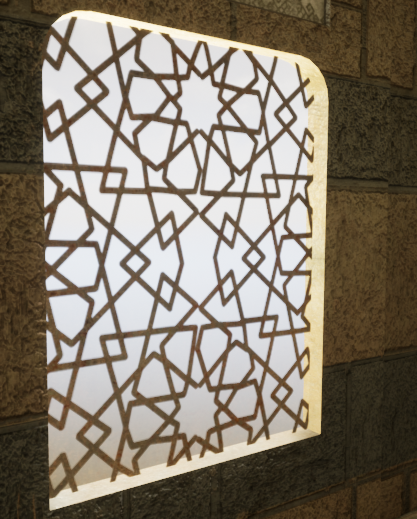
My second concept that was cut was creating an asset for a window, the idea behind the window was to create a Moroccan styled window which has cross hatches. The same window that I tried to get the light shafts to come through on, I decided to firstly make the asset using geometry. This idea was good but can be minimalism and made cheaper, after talking with Chris & Mark they mentioned that you can get exactly the same result just using a alpha card. After hearing about this and using my knowledge from my previous project I decided to go into substance designer and create the alpha and test this theory. This is what you can see in the scene instead of the geometry piece.
 The solution for this one is basic, make a alpha card, insert the alpha onto the card and import that into UE4 and save yourself a bunch of geometry and texture amounts due to the alpha only using a small 1024 at max texture space. Solution very effective but wasted time on making the asset as a whole, things need to be thought through more efficiently next time. My failure on this particular piece was time.
CRIT
After finally recieving my crit, I was told many things about my scene. The scope was too large, there was no focal point and not only that but the layout of the scene was off in relation to the 'artistic styles' of what my peers believed to be the better outcome. After seeing what was meant by my lecturer Chris & Sharon by having them edit the look of my scene in Photoshop it was abundantly clear that my layout of the scene and unrealistic overlook of the scene was completely wrong.
Here is the photo created by them showcasing the concept of where I should be heading.

This was an upset to me knowing that my own creation wasn't meeting the artistic standard but I believe this to be because of my previous burning out on my last project. After they realized what I wanted they created this and I am grateful knowing that there are people I can work with who can help provoke my inner artistic passion and more. Although just a concept it has helped to shape my whole scene in general and yet not completely change my original grey-box.
ASSET CREATION (RUBBLE PILE)
The idea behind this asset creation was to make a rubble pile using Ilya Nedyals way showcased on LVL80 (https://80.lv/articles/rubble-modular-set-production/). This was a way of creating realistic rubble piles and allowing textures to be placed using color/material IDs. The way I set out to do this was to use my pre-existing assets and get results using them and then after creating new assets if the rubble pile came with good looking results.
PHOTOGRAMMETRY
As I started to create my asset using Photogrammetry I had a few issues, primarily to do with my PC not being able to keep up with my unrealistic computations of wanting high end results whilst not using a render farm. Aside from my stupidity I asked a expert for help as the base tutorial I was following from YouTube helped me get an understanding of it and when I got stuck I kept referring back to it. The conversation is below, my photos wouldn't load into MeshLab but I realised after being told that I was using my Dense mesh which didn't contain any photos because this was data extracted from the photos instead of using the photo bundler file that I was meant to extract in the first place. Although the comments are from two weeks ago I learnt this as he replied and immediately fixed it.
After all of these outcomes I've found myself using forums and feedback more and more meaning to acquire my highest level of art is through teamwork and art appreciation.
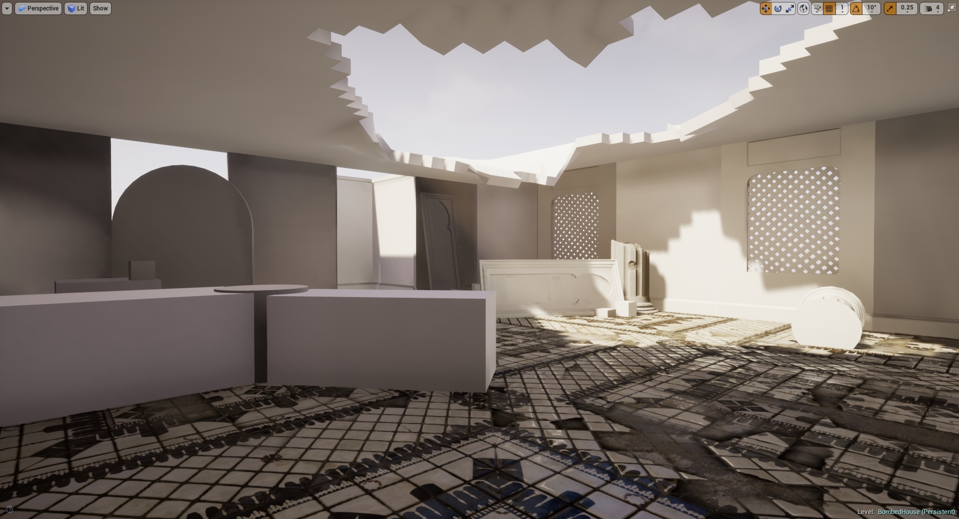
THE ROOF
The roof was something that took a little bit of time, this was something that I had done and redone a good few amount of times. I firstly started off by thinking that if I baked the material on and then vertex painted on the detail I wanted from the bake that I could use a mask to mask out the damaged areas so I could use a tileable on it and have a change of material. It ended up looking terrible shown in the image below but the process learnt helped me understand how complex vertex painting works and how I could use it in the future.
The Window Blockout
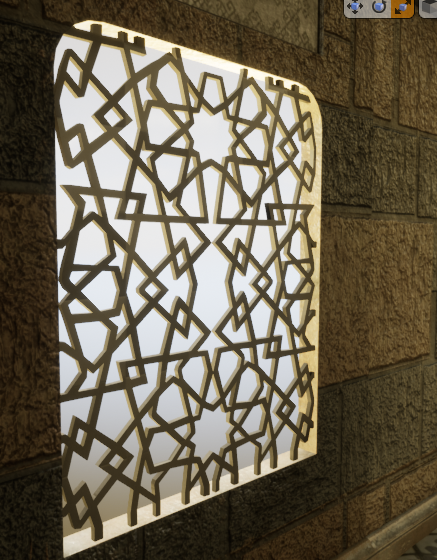
I chose to do two ways of doing the window, one alpha and one mesh. The first mesh wouldn't allow the light to transfer through, I realized the holes I made in the mesh wouldn't work. I then said previous I tried to make a alpha that would work and make it double sided, the issue with this is that I couldn't get the light to intersect with the alpha the way I wanted, it kept coming out either low resolution or not at all. I tried up-scaling the light resolution, adding more geometry and playing around with the blending modes but nothing would work. I decided to scrap this idea, not only because the alpha didn't look the way I wanted but also if I was going to attempt to fix this it'll cost more time to do rather than creating the geometry. Either way I decided to change out the meshes, here are both of them shown below.
Alpha Card:
Geo Mesh:
Level Sequencer
My level sequencer when being made would sometimes randomly do a 360. This meaning the camera doing a fast motion sick 360 randomly, I know the fix for this would be something to do with the transformation but for some reason even on a straight line this was occurring. The way I went about fixing this was by changing the transform 1 frame in front of the sequencer to match that of the next transform making it one frame 360 and that when exported out I could then remove that single frame and render the sequence together and miss one single frame which wouldn't be noticeable.

Height of the scene
During my feedback it was recommended to me to increase the height of the scene, by doing this I would create more atmosphere of a rich middle eastern man. The good thing about this was it's very easy because everything is modular and the textures can be tiled to achieve the look. Shamefully when doing it everything seemed too large, almost as if it wasn't realistic and from the feedback from Kemal it was stated that the size of everything was appropriate. I appreciate everyone giving feedback to me for my scene but for the moment I wont be upholding this. At the time I thought this was a brilliant idea but when putting it into practice my mind changed abruptly.
Employability & Job searching
This blog post is going to be based around my overall idea of where I want to be in the industry, going anywhere from Environment artist all the way to Lighting artist. My goal as usual is to work for Splash Damage a company that has been a goal of mine ever since I came to University. The constant idea of working there makes me want to continue my passion no matter the circumstance. I am constantly looking on linkdin and other job sites for offers from games companies like Splash Damage to get experience in that field of work. Shown below are some of the positions open at the moment as I've been looking rigorously for the right role. I am personally thinking any of the three, environment artist, technical artist or even lighting artist.

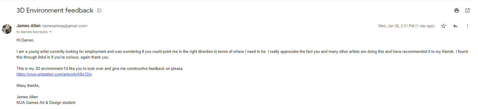
To gather feedback on these positions I've referred to asking elsewhere for concepts and ideas such as through linkd in I found a senior artist for infinity ward posting about a scheme whereby him and other senior artists are giving feedback free of charge. I immediately sent him a email with some of my work, proof below.
Other than this I am looking around for other jobs closely relating to the work of Splash Damage so that if I was to have the job opening that I want I can go and find it.
My primary goal is to get into a junior role if this isn't an option, the best place for these sorts of roles are normally posted about on linkd in but in some cases otherwise just to apply and see if any position can be filled without them promoting the job outward. After having people in from CGI (Cloud Imperial Games) they told us that mostly in their company they go into Universities, give talks and then employ through that method in terms of outsourcing juniors. This means I will have to be extra intuitive when looking for jobs as they may not be advertised.
After noticing that one of the Environment artists are Splash Damage is a big enthusiast of young and upcoming artists I decided to message him on Linkedin introducing myself and showcasing some of my work and my enthusiasm for working for Splash Damage. He immediately replied saying he would send me a email that he believes would help me in my beginnings of the career ahead. He emailed me back with very insightful and open thoughts of the games industry and how I should start off and how he got to where he is today. The image below is his full email where I took many notes and learnt new things from which I will discuss.

The environment artist John Barnard was someone who I had looked up to in terms of work on Art-station and many other traits as he has worked at Splash Damage previous and moved away and returned. The immediate thought was to message him and ask how he managed to get the job he wanted at such an amazing company. Although his thoughts here are distinct in terms of how he ended up here it shows his steps towards the goal. This allowed me to understand that maybe I wont start up at this company, I will have to do the same to in order to get the job of my dreams. He mentions within this email the good and bad points of the job and then the overall idea of how to go about getting the job that I want.
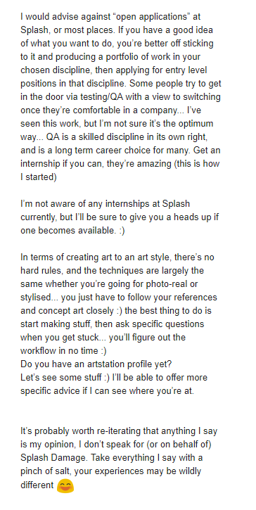
The awful but good news is that he told me he started at a internship, although this is good the bad part is he mentions that some internships don't pay well or even at all and treat you slightly under par. This started to throw me off the horse but I wont get anywhere doing that meaning my research will need to be deeper if I am to get the role and job I want. The lack of junior roles if any at Splash Damage show that I need to be around mid-level if I was to even think about applying, this means I need to start looking at companies around the same art style that have either internships or junior roles so that way I can develop my skills into that area and make my way up the 'chain' so to speak. Feedback I think personally is key here, if I am to apply for such a place then feedback on my work and feedback on my career as a whole will be needed, I will be asking my Lecturer Mark today for advice on how I should lay out my scene in accordance to this art style. This will be under another blog post this one is primarily for Job searching and Employ-ability in relation to the games industry.
After reviewing my options I decided to reach out to people who had worked for the company or currently working within Splash Damage for feedback, I didn't want to bug John anymore than I already had so I decided to go elsewhere. The recommendation from my tutor Mark pointed me in the direction of a Tech artist called Andy Davis. He had been head hunted by Splash Damage prior to working at Facebook, not only this he works with a lot of Universities and students to help them achieve their goals. I asked for feedback on both my portfolio and also what/where I should be heading in terms of getting where I need to be.


The feedback given here showcases exactly what I've been trying to get my head around, the overall ideas of where I want to be, how I wish to get there and where I should be applying my skills. The feedback given helped me with deciding what I want to do for my next scene a few weeks into the scene as I wasn't sure on what I wanted to do. Andy's feedback helped me reassure myself I was on the right path and given a lot of guidance on how to get where I want to be. Reaching out to people has easily been the best part of this project as it's given me an insight on where I want to be and how to get there.
After realising that the roles here are near and far out of my reach in terms of level of where I need to be I decided my final idea to get into this company was just like John had mentioned through either an internship or even free work for a while and just getting the basics under way. I found they have a open application and it allows you to talk to the recruiters within the company giving you a better understanding of what you need so applying to this was my first start.

My second choice was to start looking at other companies around the same skill level and looking to see if they have anything in terms of internships or junior roles. I decided to look at Foundry 42 and their open junior roles they have at the moment, some of them are interesting but nothing in terms of art or game design, I then went ahead and looked at some of their mid-level roles and what they require, looking and researching these things doesn't hurt and even applying for some roles and just getting feedback from it helps entirely.

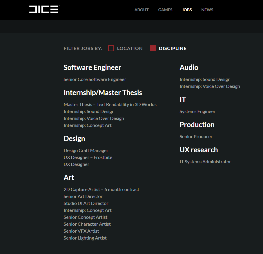
The next step was looking into companies that offer real internships and advertise them, such as Dice a company that I know uses photogrammetry in their games and makes it work to the point of realism. To apply for one of these I would need my degree and also a good looking portfolio so taking time to amend and create a good looking portfolio is definitely on the cards for the end of year project.
I will continue to look for roles in other companies and I'll stay looking at LinkedIn constantly as it seems they're the first place for jobs to be posted and getting a early application is always better than late. My understanding is once you get your foot into the industry it all grows from there, making the first jump the most important.
I then decided to Email John again and tell him my final result, I wanted to become a Environmental artist. This was a tough decision, one that would shape my career. After talking with my lecturer Chris he recommended that I should stick to environment art and once I have a job I can switch then if needs be. The lighting artist role will forever be a backup if needs be as it's something I understand to a good enough deal and know how to budget myself.
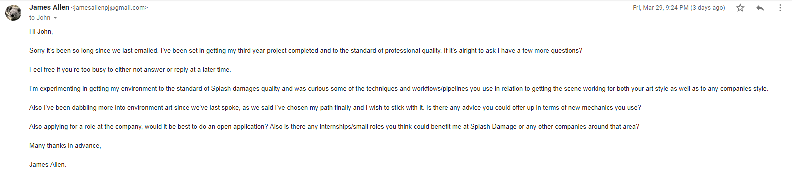
I asked about job roles and applications and where to place myself in the industry as a whole and his reply ensured me of where I need to be and what to achieve again. He also offered to check out my portfolio so I decided to send him my most up to date portfolio, once replied he will offer feedback and ideas on what to do with my latest scene.
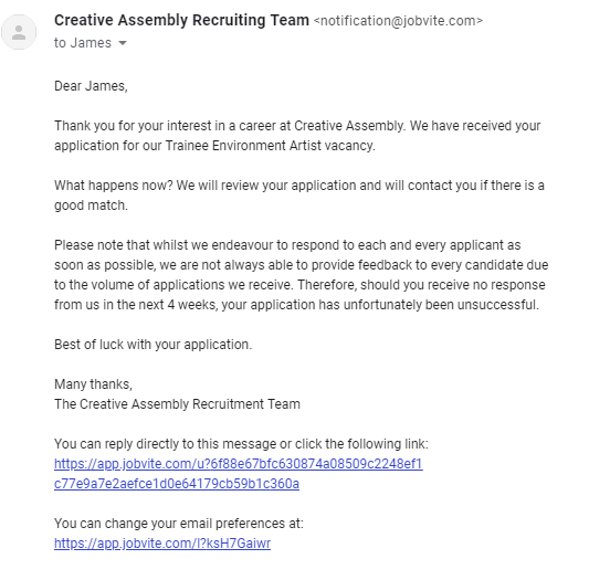
My next application after looking into more trainee roles would be to creative assembly as they provide the exact thing that the people at Digital Extremes had mentioned. I want to go for the environment art role as I've touched upon it but never properly taught how to go about doing this role entirely. I understand the basics of asset creation as well as most forms of environment art but there is always new and improved tricks to the trade and the industry is forever growing. You never know that the people teaching us could be teaching us outdated ways making this role perfect for me.

I will be applying ASAP when I manage to tailor my CV, Personal statement, Portfolio & list of questions to Creative Assembly.
Applying for roles has been on my mind for a while, keeping my eye closely on new jobs and opportunities. As this blog clearly states, I'm looking at getting a environment role at Splash Damage. The job has appeared thus I applied, the aim here is to mainly get feedback but also in hopes that I can go ahead and get at least an interview if they like/appreciate my work. The amazing thing about this is I have the ability to track my job application and understand where I'm at rather than leaving me anxiously waiting for 2 weeks. My application included my CV, Cover letter & portfolio. I applied through their website rather than Linkd in because the hyperlink on Linkd in was to their site. Even if I was to apply through Linkd in it wouldn't matter.

I've been also applying for other companies as a back up as I imagine someone like Splash Damage will be looking for a more experienced person in terms of role knowledge.
Splash Damage managed to get back to me after a minor period of time, it's upsetting to not get the role as I presumed they'd want a more experienced person but here they didn't mention much to do with art but more to do with the experience I needed. This entails that my experience overall needs to be increased in comparison to the actual level of art. I'm only presuming this by the wording but then again they may be just being polite. I'll reach out to some more of their environment artists to ask for any details referring to this.

Below are some more job applications that I've applied for, these are higher end roles that I'm applying for in hopes that they give me feedback instead of the role. I've heard Ubisoft and Electric Square are really formative and give you the exact feedback needed to get the role for the next application.


To gather feedback on these positions I've referred to asking elsewhere for concepts and ideas such as through linkd in I found a senior artist for infinity ward posting about a scheme whereby him and other senior artists are giving feedback free of charge. I immediately sent him a email with some of my work, proof below.
Other than this I am looking around for other jobs closely relating to the work of Splash Damage so that if I was to have the job opening that I want I can go and find it.
My primary goal is to get into a junior role if this isn't an option, the best place for these sorts of roles are normally posted about on linkd in but in some cases otherwise just to apply and see if any position can be filled without them promoting the job outward. After having people in from CGI (Cloud Imperial Games) they told us that mostly in their company they go into Universities, give talks and then employ through that method in terms of outsourcing juniors. This means I will have to be extra intuitive when looking for jobs as they may not be advertised.
After noticing that one of the Environment artists are Splash Damage is a big enthusiast of young and upcoming artists I decided to message him on Linkedin introducing myself and showcasing some of my work and my enthusiasm for working for Splash Damage. He immediately replied saying he would send me a email that he believes would help me in my beginnings of the career ahead. He emailed me back with very insightful and open thoughts of the games industry and how I should start off and how he got to where he is today. The image below is his full email where I took many notes and learnt new things from which I will discuss.

The environment artist John Barnard was someone who I had looked up to in terms of work on Art-station and many other traits as he has worked at Splash Damage previous and moved away and returned. The immediate thought was to message him and ask how he managed to get the job he wanted at such an amazing company. Although his thoughts here are distinct in terms of how he ended up here it shows his steps towards the goal. This allowed me to understand that maybe I wont start up at this company, I will have to do the same to in order to get the job of my dreams. He mentions within this email the good and bad points of the job and then the overall idea of how to go about getting the job that I want.
The awful but good news is that he told me he started at a internship, although this is good the bad part is he mentions that some internships don't pay well or even at all and treat you slightly under par. This started to throw me off the horse but I wont get anywhere doing that meaning my research will need to be deeper if I am to get the role and job I want. The lack of junior roles if any at Splash Damage show that I need to be around mid-level if I was to even think about applying, this means I need to start looking at companies around the same art style that have either internships or junior roles so that way I can develop my skills into that area and make my way up the 'chain' so to speak. Feedback I think personally is key here, if I am to apply for such a place then feedback on my work and feedback on my career as a whole will be needed, I will be asking my Lecturer Mark today for advice on how I should lay out my scene in accordance to this art style. This will be under another blog post this one is primarily for Job searching and Employ-ability in relation to the games industry.
After reviewing my options I decided to reach out to people who had worked for the company or currently working within Splash Damage for feedback, I didn't want to bug John anymore than I already had so I decided to go elsewhere. The recommendation from my tutor Mark pointed me in the direction of a Tech artist called Andy Davis. He had been head hunted by Splash Damage prior to working at Facebook, not only this he works with a lot of Universities and students to help them achieve their goals. I asked for feedback on both my portfolio and also what/where I should be heading in terms of getting where I need to be.
The feedback given here showcases exactly what I've been trying to get my head around, the overall ideas of where I want to be, how I wish to get there and where I should be applying my skills. The feedback given helped me with deciding what I want to do for my next scene a few weeks into the scene as I wasn't sure on what I wanted to do. Andy's feedback helped me reassure myself I was on the right path and given a lot of guidance on how to get where I want to be. Reaching out to people has easily been the best part of this project as it's given me an insight on where I want to be and how to get there.
After realising that the roles here are near and far out of my reach in terms of level of where I need to be I decided my final idea to get into this company was just like John had mentioned through either an internship or even free work for a while and just getting the basics under way. I found they have a open application and it allows you to talk to the recruiters within the company giving you a better understanding of what you need so applying to this was my first start.
My second choice was to start looking at other companies around the same skill level and looking to see if they have anything in terms of internships or junior roles. I decided to look at Foundry 42 and their open junior roles they have at the moment, some of them are interesting but nothing in terms of art or game design, I then went ahead and looked at some of their mid-level roles and what they require, looking and researching these things doesn't hurt and even applying for some roles and just getting feedback from it helps entirely.
The next step was looking into companies that offer real internships and advertise them, such as Dice a company that I know uses photogrammetry in their games and makes it work to the point of realism. To apply for one of these I would need my degree and also a good looking portfolio so taking time to amend and create a good looking portfolio is definitely on the cards for the end of year project.
I will continue to look for roles in other companies and I'll stay looking at LinkedIn constantly as it seems they're the first place for jobs to be posted and getting a early application is always better than late. My understanding is once you get your foot into the industry it all grows from there, making the first jump the most important.
I then decided to Email John again and tell him my final result, I wanted to become a Environmental artist. This was a tough decision, one that would shape my career. After talking with my lecturer Chris he recommended that I should stick to environment art and once I have a job I can switch then if needs be. The lighting artist role will forever be a backup if needs be as it's something I understand to a good enough deal and know how to budget myself.
I asked about job roles and applications and where to place myself in the industry as a whole and his reply ensured me of where I need to be and what to achieve again. He also offered to check out my portfolio so I decided to send him my most up to date portfolio, once replied he will offer feedback and ideas on what to do with my latest scene.
My next application after looking into more trainee roles would be to creative assembly as they provide the exact thing that the people at Digital Extremes had mentioned. I want to go for the environment art role as I've touched upon it but never properly taught how to go about doing this role entirely. I understand the basics of asset creation as well as most forms of environment art but there is always new and improved tricks to the trade and the industry is forever growing. You never know that the people teaching us could be teaching us outdated ways making this role perfect for me.
I will be applying ASAP when I manage to tailor my CV, Personal statement, Portfolio & list of questions to Creative Assembly.
Applying for roles has been on my mind for a while, keeping my eye closely on new jobs and opportunities. As this blog clearly states, I'm looking at getting a environment role at Splash Damage. The job has appeared thus I applied, the aim here is to mainly get feedback but also in hopes that I can go ahead and get at least an interview if they like/appreciate my work. The amazing thing about this is I have the ability to track my job application and understand where I'm at rather than leaving me anxiously waiting for 2 weeks. My application included my CV, Cover letter & portfolio. I applied through their website rather than Linkd in because the hyperlink on Linkd in was to their site. Even if I was to apply through Linkd in it wouldn't matter.

I've been also applying for other companies as a back up as I imagine someone like Splash Damage will be looking for a more experienced person in terms of role knowledge.
Splash Damage managed to get back to me after a minor period of time, it's upsetting to not get the role as I presumed they'd want a more experienced person but here they didn't mention much to do with art but more to do with the experience I needed. This entails that my experience overall needs to be increased in comparison to the actual level of art. I'm only presuming this by the wording but then again they may be just being polite. I'll reach out to some more of their environment artists to ask for any details referring to this.
Below are some more job applications that I've applied for, these are higher end roles that I'm applying for in hopes that they give me feedback instead of the role. I've heard Ubisoft and Electric Square are really formative and give you the exact feedback needed to get the role for the next application.


Lighting & Effects
Lighting is obviously the key part of creating a scene and tying it together. The idea behind my scene is to have light shafts working with a dense fog (Dust illusion) to showcase the amount of dust in the air. There were other methods of this that I attempted before hand instead of using fog which I will show below and explain why I didn't end up using them. My first attempt was creating a dust particle effect which in turn looked like fireflies floating around. The reason I wanted to create something of this level is so that the dust can be noticeable in the scene. The issue with this method was that they were far too large and making them any smaller would be a big upset/issue. Although this helped me learn a little more on particle effects I will be taking this knowledge deeper on my older previous volumetric fog particle effect. The images below are the intense outcome of what I was going for. I had attuned it all the way up but as for life span and opacity I made sure to keep it long-life span and low on the opacity meter as dust is normally very thin and hard to see unless in the light. The issue with making it like this is that it could be seen all over the scene disrupting the flow of my scene entirely. Removing this and making another attempt at volumetric fog was a must (another version from my previous scene).

My attempts of lighting have been interesting, trying to understand where and what I want. The idea so far is to have quiet a dusty scene ready for a ambush meaning that the light shafts will be minor but still visible, the dust wont be over the top and also the scene will have a overall war-time feeling due to the lighting and dust amounts along with the overall aesthetic. My first attempt at lighting wasn't so good, I attempted to setup light propagation volumes which made the whole scene look unrealistic and white. Below is my first attempt at that. Terrible start so I decided to remove that as a whole and try setting up a whole new sequence of lighting, much like previous I wanted to use a stationary light, skylight and having light shafts working with the fog rather than having to setup the light shaft occlusion which can sometimes be more expensive than you'd think. Link to the Light Propagation Volumes post I was following can be found in the references.

After this attempt I decided to change it up and attempt a stationary piece using lightmass portals for the sky light as well as lightmass importance volumes to allow for my scene to cut up the overall power of the sun giving the shadows a softer edge and allowing the overall scene to be lit using reflective capture spheres & boxes. The image below shows off the concept of that being put into place. I also added in a different temperature for the light to give it more of a day feel so that way it felt less like a light more like a organic sun. Understanding the place it's going to be and the weathers that are casted there really helps with understanding the lighting, more importantly the temperature of the sun.

After this process I wanted to get some level of light shaft working, so I decided to add in a exponential height fog to give off the illusion of the light shafts cutting through 'dust' as well as the dust itself. The reasoning for this is that it is a busy and bombed city so there will be dust everywhere especially because it's primarily a muddy and sandy city. Below is the screenshot of that, although this method was a good add it feels to me that sometimes people want it to be more intense than I want in terms of people giving feedback but realism is kinda of key for this scene. Choosing between the two will be hard but something that I will develop over time. During this I asked Chris for feedback as he knows a few people who work for Splash Damage and understands the games concept and overall feel alongside Marks as well. Chris said I needed to add some level of fog because of the overall area of the scene, as well Mark agreed but less in particle form but more in volumetric fog form. I will attempt these areas and come back to them with the scene and ask for further feedback.

I also want to try and grab some levels of light to travel through the windows, I will be attempting to set that up next as I believe it will be a good addition to the scene, more feedback will be required for this one so I will be attempting to showcase this at another point to Chris. Feedback is key for this portion of the workflow as it's the beginning of the scenes bringing together so it's a necessity for me personally.
After doing some extra research and feedback given to me by peers the so called 'dust' appeared to be too much in relation to what it'd be like in real life. This example above is something that resembles it to a much clearer state. I added in light shafts using a dynamic directional light whilst also baking lighting around it using a stationary to bounce the baked lighting around the room making everything more visible. I am going to attempt to bring down the levels of light through intensity and ask for more feedback in terms of getting the lighting correct/spot on. As for now this is the sort of lighting I wish to have, the lighting seeping through the windows is also minuscule but is still there adding in more light to the scene.
During this process me and my tutor Roger have been working closely trying to get the lighting right in my scene using slightly in-depth lighting methods showing me how if I wanted to, become a lighting artist as well as lighting solutions. During this period we were trying to figure out the lighting methods used with volumetric fog to create a distilled light shaft without having to use any light shaft occlusions or shaft blooms. I had recently used this method creating it with a dynamic light which shown here works perfectly. My next idea was to try and bake the lighting in using a stationary light, but for this it wouldn't work. The fog was just too intense or even sometimes completely broken. I then spent some time looking into how volumetric fog is created and how we can go about fixing these errors. I found this blog from Ryan Brucks which explains mostly how volumetric fog works along with some level of understanding the overall outcome and how to change the outcome to exactly what you want. I will be using this to get an idea of what I want, as for now I will be testing it in a separate scene as the lighting is where I want it to be for now.
I decided to start doing small lighting studies using basic assets, Roger had started his sessions by this point so understanding how lights work and finding new ways of manipulating them was a breathe of fresh air for me because of my recent struggles with my lighting.

This image represents a non-shadow casting point light used in two directions to emulate a lamp, it is saving data from using a standard point light as it's only cast two light sources whereas a point like would normally cast 6.

Although this doesn't look quiet right this was my first attempt at creating a light function. This was created in photoshop and I used the lens blur effect to shadow-fall the edges into making the light look realistic. This was just one form of using IES and light functions to change the appearance of a single light.

This was my single light baked stationary using 64x resolution on the lightmaps. This is using one IES profile which allows the light to look more realistic and give off a softer shadow.
During this session we were asked to light a scene given to us, the scene did not originally look exactly like this but to fit my lighting I changed the scene around to give it life. Normally this would never be done as it is normally the light built around the scene but for this one chance we were offered the ability to change anything we wished to asort the scene. I contrasted a grey outside light mixed with a pink interior to create the real contrast and then added in blocked out AO planes in the corners of the room to simulate real time shadows. They are using a non-visible plane which doesn't cast shadows but lets minor light seep through to create a darkened area using a separate light channel from the other objects. This can be used on things like TVs and other light sources to imitate the glow/light from the object. As for this scene, the TV is using the emissive channel to throw out light instead.

Another idea I had for this project was to setup my own sky dome, I was told about this by Roger so I decided to research into it. Little did I know he was going to do a workshop on it at a later date, I learnt this method from the UE4 Forum. My way of understanding it allowed me to use any HDRI and stretch it across the sphere, this method was a good way of learning and understanding it but it could be made much simpler. The image below is Rogers simple version of it but my old method was using a cubemap and exposing that as a separate parameter and allowing the image to be change and stretched using the U and V co-ordinates to change around the resolution. A small detail but an extra number having to be typed in rather than just one.

After a long scroll of ideas, tricks and understanding how most lighting techniques work I decided to give it another go, only this time using it on my final scene and trying to get the best I can out of the final lighting before handing it in. I decided here to fix all my lighting issues with all the knowledge gained as well as set up for the finale. My first issue was sorting out my light bleeding errors I was getting, there must of been a much simpler way of doing this but researching into it on the UE4 forums people suggested a number of things, up-scaling the light-map resolution seemed to be the only option. I didn't want to do this as if I want to get a high level result using low-resolution light maps I need to find a way around it. I decided to do what I used for my project back in secondary school which is called 'block lighting' which uses a box to determine where the light should bounce and where it should travel. The images below show my process.
Light bleeding under walls:

Box Blockers added in:

Final results:

Although I am yet to test out the results of both I'd imagine in terms of games this is a lot cheaper using small geometry rather than up-scaling a light-map resolution in the overall scheme of things. I will need to investigate this further to ensure I am correct.
As for that fix, I am moving onto changing my overall lighting of the scene now. I decided that I really need to rethink how I wanted my lighting to go. I was stupidly just sticking in two directionals, one volumetric and one stationary. The idea I had here was a low intensity bounce light and one powerful one that allows my light to pass through and create light shafts in the volumetric fog. I decided this was not a smart choice, rather than using a second directional why not imitate the same thing using spot lights? It'll be cheaper and maybe even give off a better effect. Here are both results, one taken from a old screenshot because I left the lighting for a while.
Before:

After:

As you can see the light itself bounces around the room more cleanly in the newer versions with less black shadows which allow me to get the light data around the room. I prefer this method as although it's using volumetric and almost cheating the lighting in that aspect I'm using stationary bakes from the spotlights like I did with the directional but giving myself the freedom to place them where and how I wish to get the exact result I want buying myself freedom. I prefer this method as I personally think it gave a much better result, although these screenshots aren't much to go by in terms of overall development I can see it myself that it looks a whole lot better and from feedback given by Roger he also agrees with me.
The last thing that needed to be done was to sort out the lightmap resolution so that way it all met to around the same texel density. The way I went about this was generating some of the lightmaps to make them fit the same texel density in the editor, some had to be overridden because of their placement and then some were just changed in the asset editor. I would go and create my own separate light maps but for this project that would be too time consuming and UE4 has a amazing auto generation in place for this reason.

Lighting References:
https://docs.unrealengine.com/en-US/Engine/Rendering/LightingAndShadows/LightPropagationVolumes
Skydome help:
https://forums.unrealengine.com/development-discussion/content-creation/2714-how-to-implement-a-standard-cubemapped-skybox?2568-How-to-implement-a-standard-cubemapped-skybox=&viewfull=1
Ryan Brucks Blog:
https://shaderbits.com/blog/ue4-volumetric-fog-techniques

My attempts of lighting have been interesting, trying to understand where and what I want. The idea so far is to have quiet a dusty scene ready for a ambush meaning that the light shafts will be minor but still visible, the dust wont be over the top and also the scene will have a overall war-time feeling due to the lighting and dust amounts along with the overall aesthetic. My first attempt at lighting wasn't so good, I attempted to setup light propagation volumes which made the whole scene look unrealistic and white. Below is my first attempt at that. Terrible start so I decided to remove that as a whole and try setting up a whole new sequence of lighting, much like previous I wanted to use a stationary light, skylight and having light shafts working with the fog rather than having to setup the light shaft occlusion which can sometimes be more expensive than you'd think. Link to the Light Propagation Volumes post I was following can be found in the references.

After this attempt I decided to change it up and attempt a stationary piece using lightmass portals for the sky light as well as lightmass importance volumes to allow for my scene to cut up the overall power of the sun giving the shadows a softer edge and allowing the overall scene to be lit using reflective capture spheres & boxes. The image below shows off the concept of that being put into place. I also added in a different temperature for the light to give it more of a day feel so that way it felt less like a light more like a organic sun. Understanding the place it's going to be and the weathers that are casted there really helps with understanding the lighting, more importantly the temperature of the sun.

After this process I wanted to get some level of light shaft working, so I decided to add in a exponential height fog to give off the illusion of the light shafts cutting through 'dust' as well as the dust itself. The reasoning for this is that it is a busy and bombed city so there will be dust everywhere especially because it's primarily a muddy and sandy city. Below is the screenshot of that, although this method was a good add it feels to me that sometimes people want it to be more intense than I want in terms of people giving feedback but realism is kinda of key for this scene. Choosing between the two will be hard but something that I will develop over time. During this I asked Chris for feedback as he knows a few people who work for Splash Damage and understands the games concept and overall feel alongside Marks as well. Chris said I needed to add some level of fog because of the overall area of the scene, as well Mark agreed but less in particle form but more in volumetric fog form. I will attempt these areas and come back to them with the scene and ask for further feedback.

I also want to try and grab some levels of light to travel through the windows, I will be attempting to set that up next as I believe it will be a good addition to the scene, more feedback will be required for this one so I will be attempting to showcase this at another point to Chris. Feedback is key for this portion of the workflow as it's the beginning of the scenes bringing together so it's a necessity for me personally.
After doing some extra research and feedback given to me by peers the so called 'dust' appeared to be too much in relation to what it'd be like in real life. This example above is something that resembles it to a much clearer state. I added in light shafts using a dynamic directional light whilst also baking lighting around it using a stationary to bounce the baked lighting around the room making everything more visible. I am going to attempt to bring down the levels of light through intensity and ask for more feedback in terms of getting the lighting correct/spot on. As for now this is the sort of lighting I wish to have, the lighting seeping through the windows is also minuscule but is still there adding in more light to the scene.
During this process me and my tutor Roger have been working closely trying to get the lighting right in my scene using slightly in-depth lighting methods showing me how if I wanted to, become a lighting artist as well as lighting solutions. During this period we were trying to figure out the lighting methods used with volumetric fog to create a distilled light shaft without having to use any light shaft occlusions or shaft blooms. I had recently used this method creating it with a dynamic light which shown here works perfectly. My next idea was to try and bake the lighting in using a stationary light, but for this it wouldn't work. The fog was just too intense or even sometimes completely broken. I then spent some time looking into how volumetric fog is created and how we can go about fixing these errors. I found this blog from Ryan Brucks which explains mostly how volumetric fog works along with some level of understanding the overall outcome and how to change the outcome to exactly what you want. I will be using this to get an idea of what I want, as for now I will be testing it in a separate scene as the lighting is where I want it to be for now.
I decided to start doing small lighting studies using basic assets, Roger had started his sessions by this point so understanding how lights work and finding new ways of manipulating them was a breathe of fresh air for me because of my recent struggles with my lighting.

This image represents a non-shadow casting point light used in two directions to emulate a lamp, it is saving data from using a standard point light as it's only cast two light sources whereas a point like would normally cast 6.

Although this doesn't look quiet right this was my first attempt at creating a light function. This was created in photoshop and I used the lens blur effect to shadow-fall the edges into making the light look realistic. This was just one form of using IES and light functions to change the appearance of a single light.

This was my single light baked stationary using 64x resolution on the lightmaps. This is using one IES profile which allows the light to look more realistic and give off a softer shadow.
During this session we were asked to light a scene given to us, the scene did not originally look exactly like this but to fit my lighting I changed the scene around to give it life. Normally this would never be done as it is normally the light built around the scene but for this one chance we were offered the ability to change anything we wished to asort the scene. I contrasted a grey outside light mixed with a pink interior to create the real contrast and then added in blocked out AO planes in the corners of the room to simulate real time shadows. They are using a non-visible plane which doesn't cast shadows but lets minor light seep through to create a darkened area using a separate light channel from the other objects. This can be used on things like TVs and other light sources to imitate the glow/light from the object. As for this scene, the TV is using the emissive channel to throw out light instead.

Another idea I had for this project was to setup my own sky dome, I was told about this by Roger so I decided to research into it. Little did I know he was going to do a workshop on it at a later date, I learnt this method from the UE4 Forum. My way of understanding it allowed me to use any HDRI and stretch it across the sphere, this method was a good way of learning and understanding it but it could be made much simpler. The image below is Rogers simple version of it but my old method was using a cubemap and exposing that as a separate parameter and allowing the image to be change and stretched using the U and V co-ordinates to change around the resolution. A small detail but an extra number having to be typed in rather than just one.

After a long scroll of ideas, tricks and understanding how most lighting techniques work I decided to give it another go, only this time using it on my final scene and trying to get the best I can out of the final lighting before handing it in. I decided here to fix all my lighting issues with all the knowledge gained as well as set up for the finale. My first issue was sorting out my light bleeding errors I was getting, there must of been a much simpler way of doing this but researching into it on the UE4 forums people suggested a number of things, up-scaling the light-map resolution seemed to be the only option. I didn't want to do this as if I want to get a high level result using low-resolution light maps I need to find a way around it. I decided to do what I used for my project back in secondary school which is called 'block lighting' which uses a box to determine where the light should bounce and where it should travel. The images below show my process.
Light bleeding under walls:
Box Blockers added in:
Final results:
Although I am yet to test out the results of both I'd imagine in terms of games this is a lot cheaper using small geometry rather than up-scaling a light-map resolution in the overall scheme of things. I will need to investigate this further to ensure I am correct.
As for that fix, I am moving onto changing my overall lighting of the scene now. I decided that I really need to rethink how I wanted my lighting to go. I was stupidly just sticking in two directionals, one volumetric and one stationary. The idea I had here was a low intensity bounce light and one powerful one that allows my light to pass through and create light shafts in the volumetric fog. I decided this was not a smart choice, rather than using a second directional why not imitate the same thing using spot lights? It'll be cheaper and maybe even give off a better effect. Here are both results, one taken from a old screenshot because I left the lighting for a while.
Before:

After:

As you can see the light itself bounces around the room more cleanly in the newer versions with less black shadows which allow me to get the light data around the room. I prefer this method as although it's using volumetric and almost cheating the lighting in that aspect I'm using stationary bakes from the spotlights like I did with the directional but giving myself the freedom to place them where and how I wish to get the exact result I want buying myself freedom. I prefer this method as I personally think it gave a much better result, although these screenshots aren't much to go by in terms of overall development I can see it myself that it looks a whole lot better and from feedback given by Roger he also agrees with me.
The last thing that needed to be done was to sort out the lightmap resolution so that way it all met to around the same texel density. The way I went about this was generating some of the lightmaps to make them fit the same texel density in the editor, some had to be overridden because of their placement and then some were just changed in the asset editor. I would go and create my own separate light maps but for this project that would be too time consuming and UE4 has a amazing auto generation in place for this reason.

Lighting References:
https://docs.unrealengine.com/en-US/Engine/Rendering/LightingAndShadows/LightPropagationVolumes
Skydome help:
https://forums.unrealengine.com/development-discussion/content-creation/2714-how-to-implement-a-standard-cubemapped-skybox?2568-How-to-implement-a-standard-cubemapped-skybox=&viewfull=1
Ryan Brucks Blog:
https://shaderbits.com/blog/ue4-volumetric-fog-techniques
Industry methods & Researching new methods
This blog post is going to be attempts at new methods of doing things as well as feedback for industry methods and best practice methods.
After speaking to my Lecturer Chris and George as well as getting feedback from Jack Kirkham I was suggested to start vertex painting on my floor. Although this was something I had already planned I tried something new, I tried to set up a parameter in substance designer allowing me to interchange the material how and where I want it. This method is good but comes at a massive cost in comparison to vertex painting.
After speaking to my Lecturer Chris and George as well as getting feedback from Jack Kirkham I was suggested to start vertex painting on my floor. Although this was something I had already planned I tried something new, I tried to set up a parameter in substance designer allowing me to interchange the material how and where I want it. This method is good but comes at a massive cost in comparison to vertex painting.
This minor mistake can cause memory issues later down the line if I was to do it this way but it was still fun to play with and to setup, I found out about this by using the parameter setup in substance designer and then googled if it can be put into UE4. The document found is linked in the references, although this method wasn't exactly what I had wanted it's still and option if I couldn't get the vertex painting to work. Not only did I find out about this method but I also found out about vertex blending, a way of bleeding two materials on top of each other, David Wilsons showcase below allows us to see what sort of idea/concept it relies on. Although this is mainly for organic materials it can still be used on my tiles, this is still a unnecessary method in comparison to vertex painting again it is still something used in industry as a way of painting organic materials together.
These methods although unnecessary work well in their own ways, for this project I'm going to keep it simplistic and go with my older more efficient method of vertex painting. It was nice to understand these processes and how they work but they aren't necessary as of yet in this project.

Aside from this there are a lot of methods based around UE4 and it's choosing which one is for you, I found this document on lighting which tells you from basic to industry levels of lighting. A link to this again is in the references. The reason I bring this up is because it allows me to further my knowledge on lighting and getting the correct lighting for the task at hand whether it be efficiency, portfolio piece or game ready. These different styles of lighting have so many options under it but choosing the correct one for your scenes or game is something that will be decided by the lead artist as it requires a good understanding and knowledge of what is needed. Understanding the lighting method is easy but putting them into practice is what makes it hard in terms of getting the correct lighting for your scene.
Another method that I was trying to do was to setup the parameters of a material from Substance Designer into UE4. Using the Substance addon for UE4 which allows you to setup the substance parameters using blueprints, I found out very soon after discovering how it's rarely ever used by talking with Chris (our lead tutor in asset creation and texture creation) because of the amount of memory and how expensive it normally is. I still attempted to give it a go but by doing this I found out just how expensive it was because UE4 crashed both times I attempted to test these methods. Either way I don't think I'll be attempting it again seeing as it was just wasting my time by crashing constantly and clearly it being so expensive. Here is the tutorial I was going to follow but ended up not (https://support.allegorithmic.com/documentation/integrations/blueprint-substance-parameters-151584792.html).
Another method that I was trying to do was to setup the parameters of a material from Substance Designer into UE4. Using the Substance addon for UE4 which allows you to setup the substance parameters using blueprints, I found out very soon after discovering how it's rarely ever used by talking with Chris (our lead tutor in asset creation and texture creation) because of the amount of memory and how expensive it normally is. I still attempted to give it a go but by doing this I found out just how expensive it was because UE4 crashed both times I attempted to test these methods. Either way I don't think I'll be attempting it again seeing as it was just wasting my time by crashing constantly and clearly it being so expensive. Here is the tutorial I was going to follow but ended up not (https://support.allegorithmic.com/documentation/integrations/blueprint-substance-parameters-151584792.html).

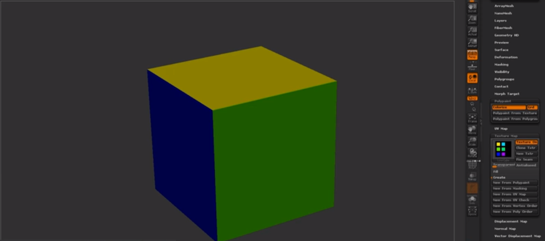
Looking further into industry methods and upcoming methods, I found a bunch of research and new-upcoming scripts that allow things like Maya to basically do what Zbrush does in terms of Zremesher. It's called polyRetopo & polyRemesh, these two small lines of code work in making a mesh increase the amount of geometry as well as bring down the tri-count the same that sub-divide and Zremesh work in Zbrush. The way this could work is replacing the whole retapology process as a whole, I've looked into the process and tried to get a understanding of how it works. The research I found out is that this doesn't yet work with imported assets from Zbrush that already contain a lot of geometry as it requires the polyRemesh part for it to work. Shown below are some pictures of it being done on a simple cube.

Step 1 create object.

Step 2 in the MEL script type polyRemesh; and it will come up with the settings on the right allowing you to change the density amount.

Steo 3 in the MEL script type polyRetopo; and it will give you the options on the right to let you change the amount you want to bring it down along with some other smaller settings allowing you to clean up the retopology. Although this is a new and upcoming addon that works but only with objects in Maya it's definitely something to look out for in the future. If you wish to delve into this further and get more of a understanding there is a freelance man making an addon to do the same concept for Maya and 3DSmax which is called QuadRemesher a link to the polycount thread will be in the references. This could potentially change the way we model but for now we can stick to quad draw as this is still in its 'beta' form and being tested. The original forum post I found for QuadRemesher (https://polycount.com/discussion/208030/quadremesher-new-auto-retopo-plugin-for-maya-3dsmax).
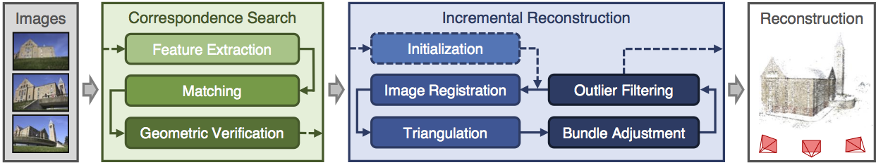
Another area I've been looking at is photogrammetry in terms of generating assets and substitute like assets which allows for a speedy realistic looking process. I personally tried touching on this, mistakenly trying the hardest thing known to photogrammetry (fur) without realizing but the results came out terribly but I'm glad I understand the process and how I can make these things game ready as well as the process needed. Below is my terrible attempt but an attempt none-the less. The programs I used to create the base was Colmap and from there created the dense reconstruction of the object meaning that the object and all the surroundings of the photos taken would print in 3D using points. This would normally create a really dense and high-poly 3D model that would need to be retapologised and not only this the process was long and tedious in terms of rendering and CONSTANT crashing unless you're using a high-end server to render. This was one way of looking into new methods that I personally wont be using again until computers are much more capable and stronger. Not only that I need to increase my knowledge in this area vastly before trying this again.

A good example of this overall process is shown below in the diagram. Firstly you start with the images, extract them out into the program, making sure they match each photo in the 'string' (string meaning line of photos taken) then trying to read the photos and turning it into a geometric form. Then from there as you have imported all the photos and made sure they have been read correctly by the software you would begin then a dense reconstruction creating a sparse map, once that render is complete you would then do the same process in terms of creating a dense depth map which is using the sparse map to be created and allowing the points to be shown in 3D forms. Then from there you would use the Fusion map to fuse it all together to make one and slowly build up your model. You would then normally by this point have some level of point to point 3D model without any textures or faces which then would be merged together after the Fusion has completed. After this you would then use the Stereo node which builds the textures onto the object for them to be exported into a games engine (Obj format) and allow you to retapologise over the top. You can then from here take the texture and apply it to your low-poly by baking it on (Normally done in blender but I'm working on finding out the way to do it in Maya). (A good tutorial document https://colmap.github.io/tutorial.html found also in references)
I then went and tried the same technique with a material, again it didn't come out as well as I wanted but that's because it was a single photo scanned and put into Substance B2M. The outcome is the image below. I basically used B2M to create this texture as most of it was necessary in getting a repeatable texture as well as creating the texture maps for this. It looks highly detailed but at the same time terrible in terms of looking realistic, a better man made job could be done in substance given the time but as for creating the material itself taking a photo and scanning it in would be ten times as fast in relation to creating a graph of this caliber. It all depends on the outcomes and how fast you are with substance designer. This is what the company Dice look for in people and most of their environment as they're looking for realistic results, if I was wanting a job for Dice I would follow these procedures.

This again isn't necessary unless of course you're looking for this result, in terms of understanding how it works I am still very minuscule in knowledge in comparison to most on this but attempts are attempts and learning the processes has easily shown further progression on my knowledge overall. This process helped me mostly understand the levels of memory and capabilities of computers and computing helping me understand why we make games as efficiently as we do.
Finding new documentation online is always fun and experimenting with it all helps me to learn more and more. Ilya Nedyals forum piece on lvl80 helps me understand how vertex color and texture color works, one is used as color ID and one is used as material ID. Vertex color uses a point cloud to color an object but texture uses UV co-ordinates. The idea behind this was to create a rubble pile with a ground plane that allows a material to be tiled over it. After struggling to understand the process completely I asked my Lecturer Chris for help but he also has never seen it done this way and the only other one who'd have a complete understanding of it Mark was away due to circumstances. Meaning I would have to fix this myself again and get more of a understanding of it by following the tutorial and understanding the complete process. Surprisingly this was the hardest to get an understanding of because of the process and the amount of small details, I imagine that once mastering this process the results can be endless. Normally you wouldn't use ZBrush for this method but after recently finding out you can set the poly groups to hold information and then using poly paint you can enable different colors to be painting souly onto different groups in ZBrush. You would then apply this to your UV map to create the texture and from there bake that onto the low-poly in something like Substance Painter using the .Obj file or any other that would carry texture/color information and bake it in allowing it to bake on the results you want.
(Trust, 2019)
Mesh decals were recommended to me as they would allow baked information to be presented on top of the object and add in small amounts of geometry changing the shape and look of the mesh. A normal decal is normally just paint or normal maps but this version allows you to change most of the geometry shown in the image below. Taken from the Unreal engine forum and how showcasing how it works. It would normally use tessellation to give off the effect further but it depends on what you prefer and on your budget of course.
(Docs.unrealengine.com, 2019)
Although vertex painting is a normal part of environment creation for me, I decided to try something new. I wanted to get baked data along with masking off an area for non-baked data to come in and allow the texture to work as a result. After asking lecturers, no one had a definitive answer they were only suggestions on how to go about it. My lecturer Stephen was the one to suggest what is now the outcome of this vertex paint. I wanted to test firstly the baked part to ensure this could work using just the UVs and exposing them on a separate UV channel from the tileable. As you can see from the textures below one is baked into the UV and one is tiled. I further decided to change the amount and the co-ords of the assets UVs to help the mask work correctly when baked in using UV 0 as the baked texture and UV 1 as the tiled texture. I then went ahead and made the mask, basked it in and went from there.

From this graph adn you can see it's cleverly split, the mask is multiplied by the tile-able allowing it to tile over the white areas and then from there it is lerped the same with the vertex paint as it would any other way using the same masks as Base Color, Normal and then RMA. This method seemed to have worked meaning my small masked area has a tiled texture showcasing a basic texture, the rest being baked in. This means now that I can add in the mesh decals learnt from before on top giving me a better looking result as well as having a break up in the textures showing off further detail. Although this is very expensive it's only for a portfolio piece so doing it in this instance is acceptable. I doubt very much it'll be acceptable in any other case, you would probably prefer to setup a master material in this instance instead if I was to do it again.

After exploring many ways of doing retapology and understanding why we do it and how we go about it I delved into the understanding of ZRemesher and how it works. I found out about PolyPaint which is a way of choosing a portion of a mesh and having things done to it through color. The way I went about using this is ZRemesher was understanding that red means to give higher amounts of polys whereas blue means to give off a lower level of poly meaning less definition or resolution in that one area in comparison. The way I went about using this to my advantage was using the photogrammetry piece which using vert colors for texture in here as ZBrush reads vert colors and not texture UVs. Here is my PolyPainted before and after.

Before with PolyPaint applied.

After with the final results showcasing the lower poly areas and the more dense.
References:
Docs.unrealengine.com. (2019). Using Mesh Decals. [online] Available at: https://docs.unrealengine.com/en-us/Engine/Rendering/Materials/HowTo/MeshDecals [Accessed 1 Apr. 2019].
L. Schoenberger, J. (2019). Tutorial — COLMAP 3.6 documentation. [online] Colmap.github.io. Available at: https://colmap.github.io/tutorial.html [Accessed 14 Feb. 2019].
Support.allegorithmic.com. (2019). Blueprint: Substance parameters - Substance Integrations. [online] Available at: https://support.allegorithmic.com/documentation/integrations/blueprint-substance-parameters-151584792.html [Accessed 14 Feb. 2019].
Trust, J. (2019). #AskZBrush: “How can I generate a Color ID map from Polygroups?”. [online] YouTube. Available at: https://www.youtube.com/watch?v=RYGkbSUaHHg [Accessed 1 Apr. 2019].
Wilson, D. (2019). Vertex Blending example. [online] Dave Wilson 3D Artist. Available at: http://ubudave.weebly.com/blog/vertex-blending-example [Accessed 10 Feb. 2019].
Wong, A. (2019). Dense Depth Map Reconstruction from Sparse Measurements Using a Multilayer Conditional Random Field Model. [online] Citeseerx.ist.psu.edu. Available at: http://citeseerx.ist.psu.edu/viewdoc/download?doi=10.1.1.715.8214&rep=rep1&type=pdf [Accessed 14 Feb. 2019].
https://polycount.com/discussion/208030/quadremesher-new-auto-retopo-plugin-for-maya-3dsmax
https://80.lv/articles/rubble-modular-set-production/
https://80.lv/articles/rubble-modular-set-production/
Subscribe to:
Comments (Atom)