Monday, 21 November 2016

Colour Theory


Colour Theory & The structure of colour


There are different colour styles which enable different shadings, colours and different colour saturation. The three different types are 'Hue, Value and Saturation'. These allow for different levels of colours whilst also having different effects on different images. Shown below are some images that use these different concepts to create an image. 

Image result for character concept

This image shows the different levels used from a simple orange and yellow mixed with dark greys/blacks to create a image as a whole. Using these different colours of orange to create this whole style of a character both using over the top greys and oranges all the way to taking out all the saturation to black and many others. 


Most of the time, people use different colour wheels to create these different styles and colours to enable them to be able to see clearly what different shades they can use whilst manipulating them to the degree they want to use. Shown below is a colour wheel which is made from different shades of primary colours.


Image result for colour wheel

This colour wheel is exactly what people use to create different shadings because it gives off the different colour shadings for each colour. They manage to manipulate these colours into colours they wish to use, or even merging them together to create new colours and shadings. The main way people go about this is using the three primary colours whilst mixing them together to create any colour they wish with the right amount of mixture.

Art, D. (2016) Character concept art: Mage. Available at: http://kenji893.deviantart.com/art/Character-Concept-art-Mage-618243252 (Accessed: 21 November 2016).
The gardener’s Colour wheel (no date) Available at: http://www.wyevalegardencentres.co.uk/the-gardeners-colour-wheel (Accessed: 21 November 2016).

Saturday, 19 November 2016

Research - Cathedrals/place of worship


Development research - A place of worship

This project was something I had been hoping for, something that I can manipulate because of it's ability to give off the impression of a place of worship. I've always drove myself to believe that there is no religion that could influence me into it. My way of worshiping is being able to relax whether it be in a area that isn't inhabited or somewhere where there a busy society but has since been destroyed. These places to me are a place of worship. The concept behind a religious building doesn't attract me, it makes me feel pressured, thus this project not being related to them at all. Back to the project at hand, when researching into a 'place of worship' all that came up was religious idealistic buildings. To avoid this I had to specify what I wanted to make around my project. What better than my idea of a place of worship. I already had an idea of what I wanted to do as my favorite game at the time of making this project was Destiny. This game had the exact art-work that I love. Destiny bases itself around these dilapidated ruins and the idea of 'forbidden cities'. The image shown below was one that took my eye immediately as this is exactly my idea of a place of worship. 

Image result for destiny mars

This image has given me many different ideas behind what I can do, I'm primarily going to attempt this project in 3D because my 2D city-scapes look terrible in comparison. The idea that this image is based around a planet in the sky as much as it is the city also has given me ideas on where I want my project to go. My idea is some sort of city based around a person just like most football grounds have outside, that one player they all admire and look up to. Much like Arsenal having the Thierry Henry shown below. This gave me the idea to base my city around a person or being, no one special just something to show off an idea of a special being or someone that mattered to them.

Image result for thierry henry statue


Enough research has been done for me to have an idea, I already slightly had an idea for this project which made research harder to do because I was so fixated with doing what I wanted. I need to be able to adjust to change for the next project, especially because not everything will fall into place like this has. 


Rice, S. (2016) Thierry Henry statue outside arsenal stadium has face mask put on it by protesters. Available at: http://www.independent.co.uk/sport/football/premier-league/thierry-henry-statue-outside-arsenal-stadium-has-face-mask-put-on-it-by-protesters-a6989281.html (Accessed: 19 November 2016).


Machkovech, S. (2014) Destiny: It’s a small world after all. Available at: http://arstechnica.com/gaming/2014/09/destiny-its-a-small-world-after-all/ (Accessed: 19 November 2016).

Research - Jewelry

Development research - Jewelry 

My concept idea behind jewelry is something that allows people either to be happy or something that extends there restrictions I.e. Wheelchairs, prosthetic legs or even something as simple as a music device of sorts. I would prefer to do something that makes people 'happy' because its something that I thrive as a person to create, a happy and enjoyable situation. My first idea was to take a look into the area behind Jewelry whether it be crowns, jewels themselves or pieces of jewelry. Obviously this is the task at hand but I wanted to see what came up as I wanted to see how far I could stretch the idea of jewelry before it became out of hand. This was one of the suggestions, although it's a fashion piece it really stretches the idea behind jewelry. This was something I wish to take over, especially the girl to the right, something that takes a hold of the face. 


The was one of the main factors for me choosing some ideas as I thought it was something that people would believe to make them either 'happy' or look 'beautiful'. Almost as if it's a mask feature but made to showcase the face not cover it. This lead me to look into masks and how they function, the main one I know of is ski masks used by the military to avoid materials flying at their faces.

Philippines chooses Turkish NVGs

This was the first item I came across which gave me the initial ideas of making some sort of mask/crown that would enhance the persons vision. I will make a few silhouettes and see how it turns out. I will continue to look into masks as a whole but enough research has been done and given me enough ideas to create some low-level concepts out of, if it's not enough I shall return to the drawing board.
Weiner, A. and Rutherford, C. (2015) Bijoux, Bijoux: Fall 2015 jewelry report. Available at: http://www.harpersbazaar.com/fashion/trends/g5636/fall-2015-jewelry-trend-report/ (Accessed: 19 November 2016).


Arthur, G. (2016) Philippines chooses Turkish NVGs - news - Shephard. Available at: https://www.shephardmedia.com/news/landwarfareintl/philippines-chooses-turkish-nvgs/ (Accessed: 19 November 2016).

Thursday, 17 November 2016

Self Evaluation

My self evaluation

Personally over the course of the 8 weeks and the three projects we had to have completed I believe I finished at a reasonable time. If you asked me before-hand whether I'd be able to get it done I would of probably said no due to not being much of a 2D artist but more of a 3D artist and game developer. 


With the outcome of each of these projects, I believe that it was a brilliant success after the short period of time we had. Especially as my Photoshop skills and 2D skills were very limited at the time. I had previously used all of the programmes used to create these concepts, including 'ZBrush' which is a 3D programme that I made, rendered into 'Keyshot' and then turned into 2D models. In doing this is helped me build a more structured 2D image and allowed for me to use my common skills on Photoshop of shading, colouring and even air-brushing to make the images look as good as they have. 

If I was to do anything different or even something to change what the outcome was, I would defiantly try to organise my time a LOT more. This is something I'm going to attempt to work on in the next project as I've realised that being slightly behind is never a good thing. The reasoning this is so big for me is because it didn't allow me to get all of my ideas down and illustrate all of my ideas forcing me to move forward. Although this is a negative on this part of the project it will allow me to recognise it for the next projects and push me to use my time more productively rather than spending my time putting detail into 3D models that I am going to use merely as a 2D image. This was one of the main reasons I fell behind. 

Overall I believe it went well, all of my images, iterations and model sheets helped me to reach my final goal which was the initial idea behind this project seeing as it's concept art. At least that's what I believe concept art is about, giving ideas and allowing people to see your understanding of certain things. 

http://jamesallengame.blogspot.co.uk/

Concept Character - My steps towards a final idea(s)


Concept Character - My steps towards a final idea(s)


The concept behind this task was to create a character based around the fairy-tale "The Tinderbox". I was told to ensure that I make something along the lines of a 1700's Georgian European who could be any of the characters in the story. I chose to create the soldier figure because of his flexibility with how he could be interpreted. 

My initial idea was to go along with an idea of making a  soldier who was militarised, going along with this concept after doing research I found out many supposed soldiers turned rogue, either being mistreated or underpaid. This allowed for me to come up with the idea of making a pirate based soldier. Shown in the image below are some ideas I had for the pirate and different poses based on his movement actions. 

These silhouettes I put together allowed for me to get an understanding of what my pirate was to look like as well as the slight difference in stances, clothing and miscellaneous (i.e. the peg leg and crutch). In doing research I found many photos based around a pirate captain, not many were jewelled or even some weren't very well clothed shown in the image below. 

Image result for 1700s georgia pirate
(Mary Read, 1690–1721)

The image shown above was research I found of a female pirate named 'Mary Read' who was a very notorious pirate during the early 1700's. I wished to loosely base my character off of her backstory but less around the look, I wished to go for more of a stereotypical styled pirate and also switching gender because most women were refused to be a part of the military due to sexist men. Using the crutch, peg leg etc. I decided to add these into a more of an in-depth character drawing them in more of a grey-styled painting shown below. 


As you can see I've wrote some parts to ensure that I have the most amount of information given to the people who will be creating the concept. Although it was a solo project I wanted to also be able to leave myself this information in case I forgot about it or wanted to either delete or add in the information given. The concept behind these 3 figures was to create a stance that allowed for me to give off the impression of a pirate in-stance or in motion who was either looking tough or looking with a exploration styled pose. I wanted to try and give off the idea of a pirate with both in the end choosing my next imagery to be something looking tough along with a strong independent pose. 
Uncoloured and unfinished this was my initial concept that I wished to proceed with and achieve some level of getting to an end with this project. I still didn't like the idea that he looked so 'young' in this piece, but with time limitations I had to add the age through his pose and his structured body. By doing this I had to readjust a lot of his body through manipulation in Photoshop. Doing so and adding detail and a background I came to make it in 3D. 


After doing it in 3D just before making my final piece I had to decide on the colours I wished to use, these allowed for me to make a colour sheet to get an understanding of what colours I'd like to see.


This concept was the one thing that allowed me to give off and understanding of how I wished for him to pose, as well as how his body needed manipulation in the final piece. The final concept shown below was the outcome. 


This final piece was the idea I had intentionally at the beginning of the project. Although the idea changed dramatically in pose, drawing style and his age. I believe it came out rather well in that sense. I'm happy with the outcome and managed to get it finished within enough time to add a proper detailed background with him being in enough detail also. 


Mary Read (2016) in Wikipedia. Available at: https://en.wikipedia.org/wiki/Mary_Read (Accessed: 17 November 2016).

Wednesday, 16 November 2016

Composition - Divine proportions

Divine Proportions 


Divine proportions are something within a image which allows you to split it up into different shapes to understand the image in more detail. 


The concept behind the image is something so subtle that being a lions face, the divine proportion layout in this image makes you focus on the 'focal points' (the 4 circles making a rectangle). These focal points allow you to see where they want the eye to be focused on, in and around the eyes. The way this is laid out is the same any painting is, most rely on these focal points to enable them to create the photo or painting. The idea behind the focal points is to capture the most enhanced part of the image whilst also sustaining a equalized level of information. Some people do break this and turn the rectangle into many triangles like shown in the image below. 


This image of a crocodile is something that breaks this imagery, it allows for more focal points to be made. In doing this it creates a move sustained image by having you focus on a lot less information. The information given by this image shows that the focal points have been slanted and re-adjusted to amend for the crocodiles movement. Show in the image below.


Using the focal points and re-adjusting them allows for a more improved quality of picture in my eyes. It makes it more sufficient although it has been moved it has kept its original rule of having the 4 focal points. The focal points can be adjusted and more can be added to certain photos dependent on the size of it so there always can be more than 4 but I've chosen not to go down that route because of it's complexity and it isn't very attractive. 


Incredible studio portraits of wild animals by B. Wilson (no date) Available at: http://www.boredpanda.com/animal-photography-studio-brad-wilson/ (Accessed: 16 November 2016).

How does the design of Final Fantasy VII create meaning

How does the design of Final Fantasy VII create meaning


Final Fantasy VII (FF7) is a role-playing game developed by Square Enix and released to the Sony Playstation in 1997, and to the PC in 1998. I will argue that the game took traditional elements of RPG games and combined them with influences from other genres in a new and effective way, which is why FF7 remains significant and memorable.
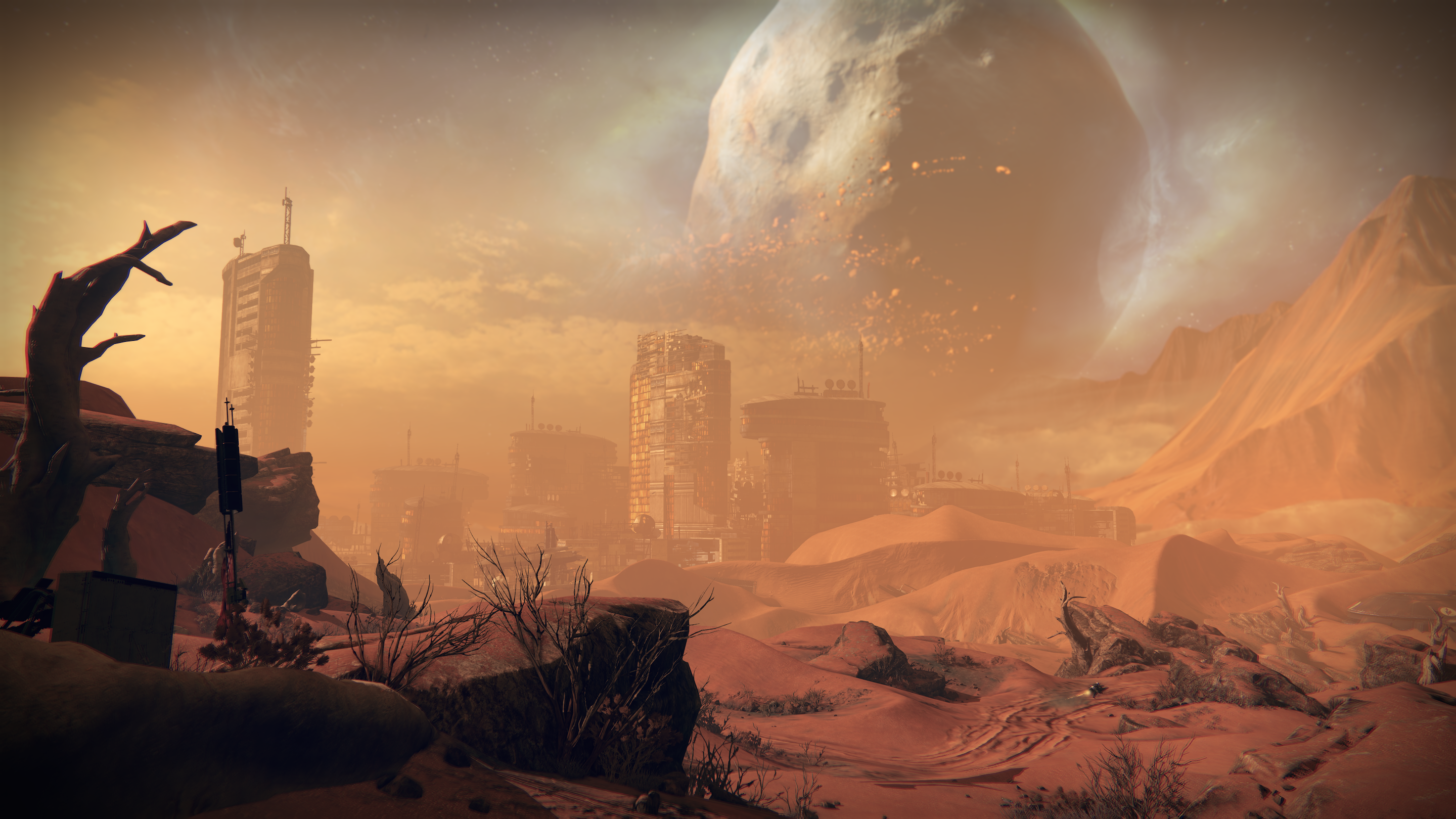
FF7 was the first in the Final Fantasy series to combine 3D graphics with 2D pre-rendered background art. This approach was innovative at the time, as the Sony Playstation was still a relatively new platform (it was launched in 1994) and games developers were still experimenting with how to harness the platform’s 3D capabilities. This innovation could be said to have helped players empathise with the characters, as they existed in three dimensions for the first time. The game’s aesthetics present a mixture of cute, cartoon-like, manga-inspired imagery with more realistic, or naturalistic artwork. It mixed traditional fantasy elements (swords, magic, goblins) with a futuristic, steampunk sensibility (machinery, modern weapons, and gritty, industrial settings). On the whole the game has a unified look and feel, although in retrospect the aesthetics are inconsistent in many ways - a paradox which may actually account for the game’s popularity, possibly because it was an exciting and novel approach. For example, there is a jarring difference between the blocky 3D characters and the painterly backgrounds, or the combination of low-fi dramatic scenes with cinematic CGI sequences that mark the end of chapters in the story. This contrast gives the fictional world a feeling of dissonance, but also an exciting sense of synthesis and cohesion.

The game creates a fictional world on a global scale, mixing a traditional RPG setting of ancient kingdoms and quaint villages with an industrialised dystopian future. It presents a variety of terrains, cities and villages, and people to interact with, which create a strong sense of cultural and ethnic diversity. The locations are fictional but recognisable. For instance, the village named Wutai is reminiscent of an antiquated Japanese village, and Cosmo Canyon has the feel of an American Indian settlement. The soundtrack also reflects this diversity, and the scenery and associated imagery often feel as if they have been directly appropriated from the real world. The effect of these elements is that players bring their own associations to the game, and as such it could be said to assist with making the drama more human-entered.

The story proceeds with an escalation of different types of crisis. The game begins with a city-scaled crisis where the mercenary Cloud and his rebel gang try to overthrow the Shinra Corporation, the ruling power, and ends with a global crisis of an approaching meteor that will destroy the planet. The overall storyline brings together the elements of the ‘epic’ form of narrative. It centres around the adventures of a hero, involves deeds of superhuman valour, has a vast setting, and deals with the supernatural (Drake). The plot is complex and large in scale, and contains numerous subplots, side quests and secrets. Many themes are explored, allowing for a range of different tones and emotions to emerge, from death and to romance and comedy.

A particularly memorable aspect of FF7 is the characters. The characters are in fact caricatures, with exaggerated body parts, enormous hair, impossibly muscled arms, and could be said to be stereotypes: the adorable female, the tough stubborn guy, the heroic yet brooding protagonist. However the rendering of the character’s inner lives is in-depth and complex, which works against them being clichés, and invites the player to invest emotionally in them. Some of the characters even undergo role reversals, for instance where the ‘“damsel in distress” character Tifa actually comes to Cloud’s rescue’ (Group, 2016). This inhabiting of multiple roles can be related to Propp’s ‘spheres of action’.

The characters all have different goals, and this informs how we can relate to them. The protagonist Cloud is an eco-warrior with lots of personal demons, a kind of flawed anti-hero. The villain Sephiroth is a disillusioned hero - a good guy turned bad. Barret is a lot like Mr. T from the A-Team: hot-headed but essentially good. The characters often mimic stereotypes from the real world, but they are always nuanced and fascinatingly portrayed in the game. Together they create conflict and rivalry, or agôn, and help to build a convincing portrait of a troubled but hopeful society with its own hierarchies and power struggles.

FF7 is full of variables. Chance-based encounters with enemies create suspense, and the turn-based event system is always evolving and being affected by randomly imposed constraints and Random Number Generators, which can create a disorientating sensation, and introduce a degree of instability, or Ilinx, into the gameplay. The challenges FF7 presents are compelling because they directly affect the way the characters develop, and to some extent the story itself, however some of the technical challenges were perhaps too difficult for some players. For instance, some reviews at the time of the game’s release praised the game’s magic system, stating that the ‘special attacks and spells [...] are the game's strongest points’ (Boor, 1997), whereas others were baffled by its mechanics: ‘The magic system is so complicated as to defy simple explanation’ (Dulin, 1998). But the free-roaming world map, and the ability to customise a character's magic, weaponry and armour can be said to create a sense of freedom, or alea, where the player feels that he or she is in control of his or her own destiny. FF7 was important for challenging the idea of linear progression in a game. It was an important step towards the degree of agency seen in the games of today, where the player can influence the outcome of a narrative, or experience several narratives (for instance, the ‘butterfly’ effect). I think it is this sense of freedom which helped to make FF7 a meaningful and rewarding experience. The game can be said to be more ludus than paedia in its freedoms - more controlled and rule-based than spontaneous or improvisational - however it took important steps towards giving the player more agency. (Caillois, 1979).

FF7 is still relevant and memorable today as a game that changed gamers’ perceptions of what an RPG could be. Since the release of FF7 the audience for the RPG genre and the sheer amount of games has grown considerably, yet FF7’s iconography is still popular in the wider culture. Its characters have appeared numerous times in related games and movie franchises, orchestras have played public performances of the game’s soundtrack, and by popular demand the game is being remade for the PS4, proving that it still has appeal for a modern audience. FF7 was the most significant step in the Final Fantasy series towards challenging the possibilities of the RPG format, encouraging the series to ‘move beyond simple genre fiction and into critical examination of what that fiction means’ (Mackin, 2016).


Bibliography

Boor, J. (1997) Final Fantasy VII. Available at: http://uk.ign.com/articles/1997/09/04/final-fantasy-vii (Accessed: 4 November 2016).

Dulin, R. (1998) Final Fantasy VII Review. Available at: http://www.gamespot.com/reviews/final-fantasy-vii-review/1900-2536027 (Accessed: 4 November 2016).

Mackin, H. (2016) Final fantasy VII’s legacy gets everything about final fantasy VII wrong. Available at: https://www.pastemagazine.com/articles/2016/04/final-fantasy-viis-legacy-gets-everything-about-fi.html (Accessed: 4 November 2016).

Drake, T. Six elements of the epic (no date) Available at: https://www.webpages.uidaho.edu/engl257/General%20lit/six_elements_of_the_epic.htm (Accessed: 16 November 2016).

Caillois, R., Barash, M. and Caillos, R. (1979) Man, play, and games (les jeux et les hommes, engl.). New York: Schocken Books.


Amelivia, J. Final fantasy VII scene reconstruction using blender (part 1) (2015) Available at: http://namelivia.com/final-fantasy-vii-scene-reconstruction-using-blender-part-1/ (Accessed: 16 November 2016).

Thursday, 10 November 2016

Concept Cathedral - My steps towards a final idea(s)

Concept Cathedral - My steps towards a final idea(s)


My idea behind this task was to give off the impression of a cathedral or place of worship without drawing the normal idealistic ideas being either a church, mosque etc. I wished to showcase this work so that people have an understanding that anywhere can be a place of worship and it doesn't have to relate to any religion or story. 


I've numbered my concepts so you can understand which one I am talking about in each paragraph by numbering the paragraph accordingly. 

1. This initial concept was a idea I had stumbled upon after playing games such as 'Skyrim', 'World of warcraft' and 'Farcry'. This concept is something that can be created easily, it was the idea that a place of sanctum. The idea was that it was a large beast of any kind that had passed away with it's mouth left open whilst also being turned to stone. Something alone the lines of a dragon dying and being turned to stone upon death. The inside is designed with a church styled theme which was something that didn't interest me as much because I wanted to steer away from that concept. 

2. A city-scape is something that I have personally always worshiped for some unknown reason. It interest me because of the amount of information it can give out at one time whether it be thousands of people roaming around or even if its desolate and evacuated. The idea behind this that I interpreted was the idea of a street being so visually busy but also being so dead because it's been deserted for many years and beginning to deteriorate. My idea with this was to create something that allowed the user to be able to concentrate on the city itself but also notice some level of destruction around it, being a concept/silhouette I didn't want to go into such detail just yet, I was just wanted to get a minor amount down just so people can get an idea of the city being the overall 'place of worship'. I have heavily referenced the game 'Destiny' here by using the 'Tower' in the game as a reference because the small city in the tower is their place of worship. I chose to leave this at number two, although it was my continued idea because it's something that is so open to interpretation that allowed for people to get a understanding of what my mind works like and why I chose this over the others. 

3. My next idea was something that was unique in a sense of structure and something that people can relate to. The idea behind it was a circus styled tent which people would find as either a place of comedy, or horror. Playing on the idea that some people have an irrational fear of clowns (coulrophobia) it can be either a place of worship or a place of torture which to some is a place of worship. I didn't wish to continue this because I wanted to get across the 'worship' side of this task so to some this wouldn't be a place of worship.

4. This concept is something very heavily referenced although not quite to the point of being a stolen idea. This related a lot to the game destiny in the way it is designed. Taking ideas from the new DLC (download-able content) 'The Rise Of Iron' there are a few buildings designed structurally on it being held in the air by beams whether its made from steel or a flesh like substance. I took this idea and made it my own by having it made from glass. The idea behind this was a gravitational effect that was slowly breaking the building bringing it to the ground overtime being that it was overweight for its structural integrity. Showing signs of it happening with shattered glass slowly floating away from the concept. The reason I didn't choose this was I wanted my own, unique approach but something that also interested me.

My iterations speak something along the lines of what I wanted to go for but aside from the 3D aspect of the other iterations that went onto becoming the final piece it allowed for me to have other ideas such as the two shown below, along with the 3D concept.


This iteration was something I wished to base my initial idea on. Something that was a reminder of someones "home". People have different definitions of "home". My idea is home is a city-scape but to most that would seem wrong or seem idiotic. To some it's the country side, some streets, to some even their own house. This image above shows a singular building referencing this idea of a home. 


Again this is something that is related to the idea of a home. Something that shows warmth, something to travel towards. I made it harder to see so that there is this level of mist/fog attracting the eye towards the light but also tricking them into the wrong section of light. Although the light in the top right is the most attractive, the light on the object in the left is what people will realise is the home in this picture. It may resemble to some what home means, whether it be a house, a source of light or even a source of comfort. 


This was the idea I had in mind, although it is all misplaced it was done so on purpose and you'll see from the final drawing shown later. The idea behind this was to have a city based around some sort of demi-god which looked over the city and kept them 'safe'. I haven't chose a certain god or person because I don't want to justify a religion I just want it to be a common myth. The city was something that was more interesting to me than the headpiece but also I was intrigued to try and keep it in but subtly so that it didn't steal the focus. The idea of it was referenced from 'Final Fantasy 7's' 'Midgar' which had a building centralised as a place of higher rankings within the city. I wished to choose this because of the rural feel it gave off as well as a ancient feel to it. Thus bringing me onto my next set of renders. 


This render allows for me to show you why I didn't need to have the city properly places on the sculpture, because I already knew I wanted to crop it down. The reasoning behind this was so that I could edit it exactly how I wanted with enough detail but not too much to have the image look overly colored. It was a simple idea which allowed me to use many different ideas in the end to create my final piece. I since changed the material and began creating my final piece. The images below were the 2D images I extracted into 3D showing off the structural points in both images. These are how I made my city in the final piece. 


This was my final piece, as you can see I managed to cut out a LOT of unnecessary information. The reason I chose to do this was for the pure fact I wanted it to have a desolate, dilapidated and dead feel to it. The idea behind this was a sand covered city which had been abandoned for many years and people were only just going in to discover history, just like today's society with cavemen. The reason I chose sand over any other environmental material is because of its destruction but also how little it can effect things, it can overgrow but not destroy. The basics behind it is the city is still covered in sand and being filled up slowly by sand storms thus people trying to get in now rather than when it's fully covered. I decided to delete a lot of the buildings and cover over them not only for the idea of having a city buried under sand but also to give off a gradient feel. I believe the lighting in this is done perfectly according to the sandstorm and also having it shimmer off some surfaces. 


I believe this final piece is enough to give to someone to be able to grasp the idea behind it.


I thought I'd add in one of my other concepts just for the pure fact that I decided to go environmental because of its beauty and also because of its destruction. This image above represents what I was looking to do, showing both the human-factor of placing a simple road and then having the environment fighting to get it back by slowly overgrowing into the road. This was just a concept that I had originally left out but I've decided to add it as it gives off what I wanted to achieve.